
ManaMD combines authoritative healthcare data, a native app for iPhone and iPad, and an AI assistant into a single tool for medical device field teams. This page covers the main capabilities. For how they fit into a working day, see For Reps.
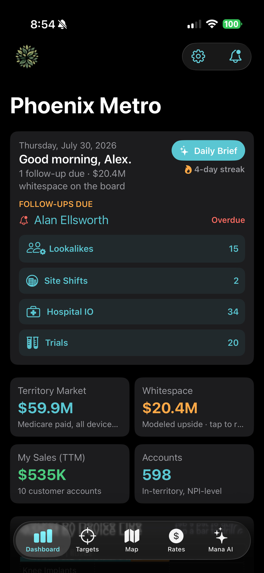
The dashboard totals your territory: Medicare payments across your device lines, modeled whitespace, your trailing-twelve-month sales, and account count. A chart breaks the market down by device line, and each bar drills into the accounts behind it.
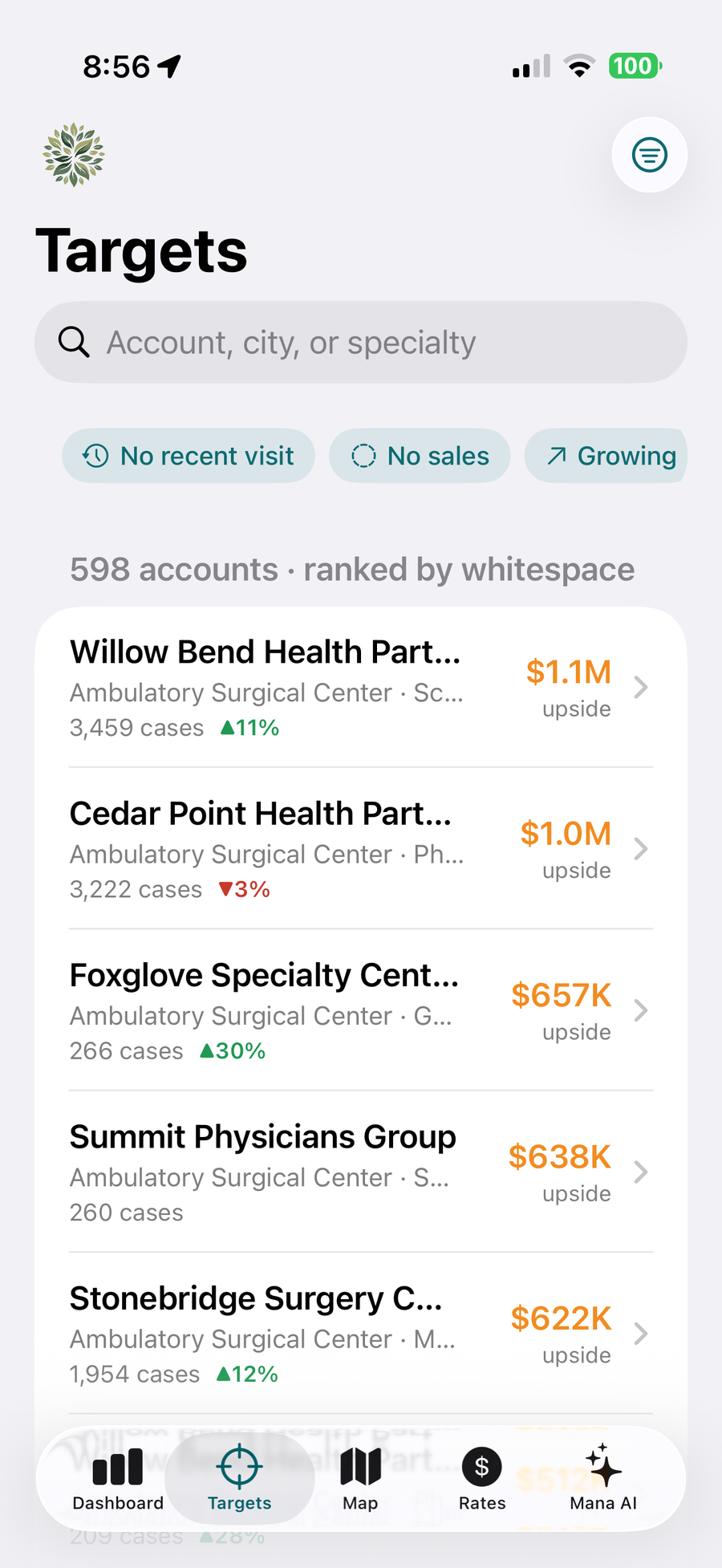
The Targets list ranks every account in your territory by whitespace. Whitespace is the modeled device opportunity for the account minus your recorded sales there, so accounts you already own drop down the list and untouched volume rises to the top.
The underlying sample is Medicare claims, calibrated to Medicare's share of enrollment in your specific counties. It is a proxy for the whole market, the app says so on every screen, and the data page explains the method.
Filter by device line, search by name, city, or specialty, and set a status on each account: For Review, Target, Customer, or Deprioritized.
Each account page shows case volumes and Medicare payments by device line, two years of trend data, quality star ratings, the patient panel's size and average risk score, and contact details with tap-to-call and tap-for-directions.
Below the data: your notes, visit history, follow-ups, and one-tap actions for logging a visit or scheduling a reminder.

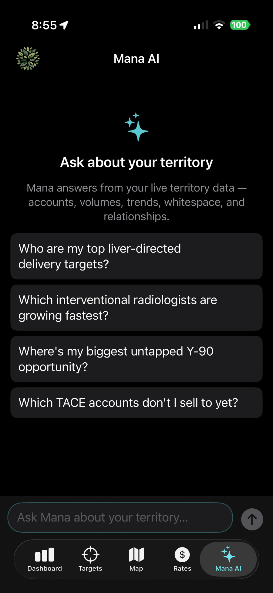
Mana answers questions about your territory in plain language: fastest-growing interventional radiologists, biggest untapped opportunity in a device line, competitive accounts worth a visit this week. Every answer is generated from your territory's data, and accounts named in an answer are tappable links.
Mana also writes your daily brief, pre-call briefs, and introduction emails. If a figure reflects Medicare-only data, the brief says so.
Mana works in economics and market data: reimbursement, procedure volumes, payment relationships, and your own activity. It is not a clinical reference, and it does not generate clinical or product-performance claims. Your compliance team can review its outputs during the pilot.
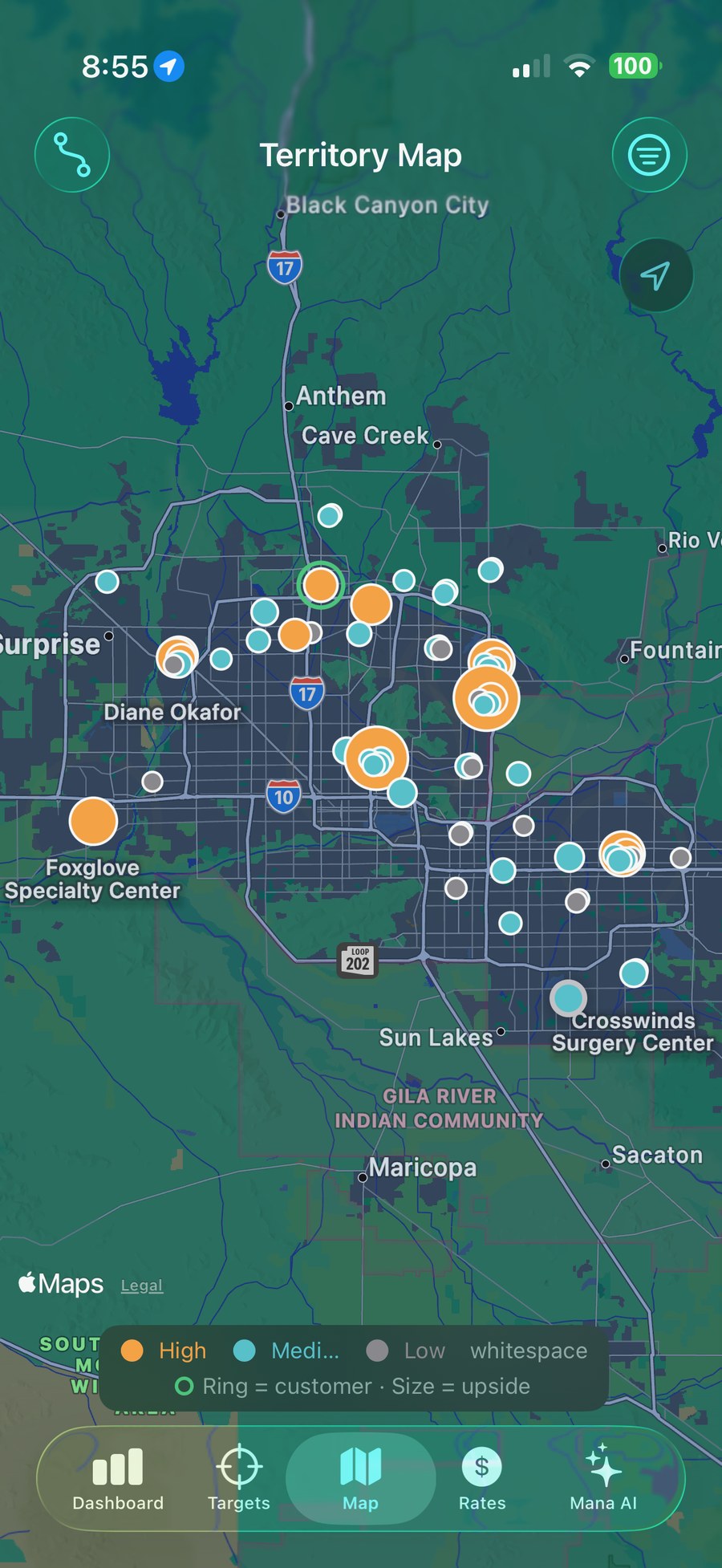
The map shows every account as a pin sized by upside, with customers and whitespace accounts in different colors. It is the fastest way to plan a route or spot a cluster of opportunity you have been driving past.
Reimbursement by CPT code and care setting (physician, office, ASC, hospital outpatient) with year-over-year changes, plus your organization's contract position per product against regional and national averages. The economic conversation, prepared.
For each account, see which competitors have payment relationships there, how much, and what recalls or new clearances those competitors have had recently.
Generate a clean PDF summary of any account, co-branded with your company name, for leave-behinds or internal reviews.
Facility-side procedure volumes for hospitals in your territory, outpatient and inpatient, with star ratings and ownership type.
Recruiting device trials near your accounts, grouped by device line, with competitor-sponsored studies flagged.
A morning brief at 7 AM and notifications during the day when an account surges, a new provider appears, or a competitor has a recall.
Create an opportunity from any account page and it lands in your CRM pipeline, attributed to the account and device line. We connect to Salesforce, HubSpot, Microsoft Dynamics, and Veeva, and we scope other CRMs during the pilot. The whitespace list becomes pipeline without re-keying anything.
Follow-ups drop onto the rep's calendar automatically, and visit notes can be dictated instead of typed. Logging happens in the parking lot, not at the kitchen table.
Managers see adoption and activity by rep (visits logged, follow-ups set, briefs generated) in the app and on the web. You know the tool is working without asking.
Demos run on live product with real data, not slides.
Request a demo →